
Third-Party Risk Intelligence
Shifting SVigil (Supply chain security) from "data-heavy monitoring" to an "insight-driven prioritisation and remediation platform."
Overview
Enterprise companies depend on hundreds of third-party vendors. Every vendor introduces security risks—exposed assets, leaked credentials, outdated technologies, vulnerable servers, and much more.
SVigil (Supply chain security) helps organisations continuously monitor these vendors.
The problem was that the product had become very good at collecting security data, but not very good at helping users decide what to do next.
Customers were looking at thousands of findings every day, but they still struggled to answer simple questions like:
Which vendors are the biggest risk?
What should I fix first?
Which action will have the highest impact?
Our redesign focused on answering these questions instead of simply displaying more security data. This direction is also reflected in the product vision of shifting SVigil (Supply chain security) from "data-heavy monitoring" to an "insight-driven prioritisation and remediation platform."
Understanding the Users
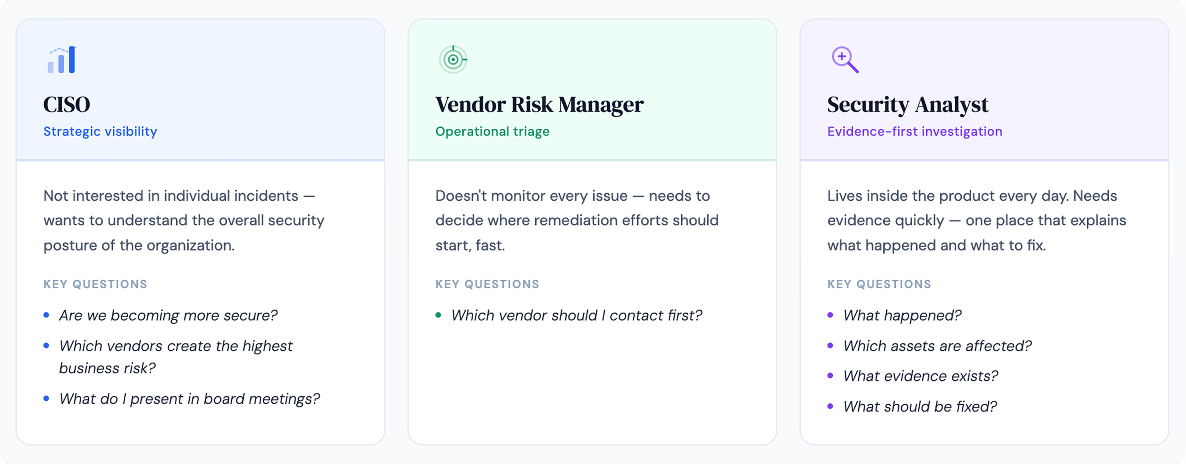
Before starting the redesign, we worked closely with the product team to understand how different users interacted with SVigil (Supply chain security).
Although everyone used the same product, they all had different goals.
The Problems We Found
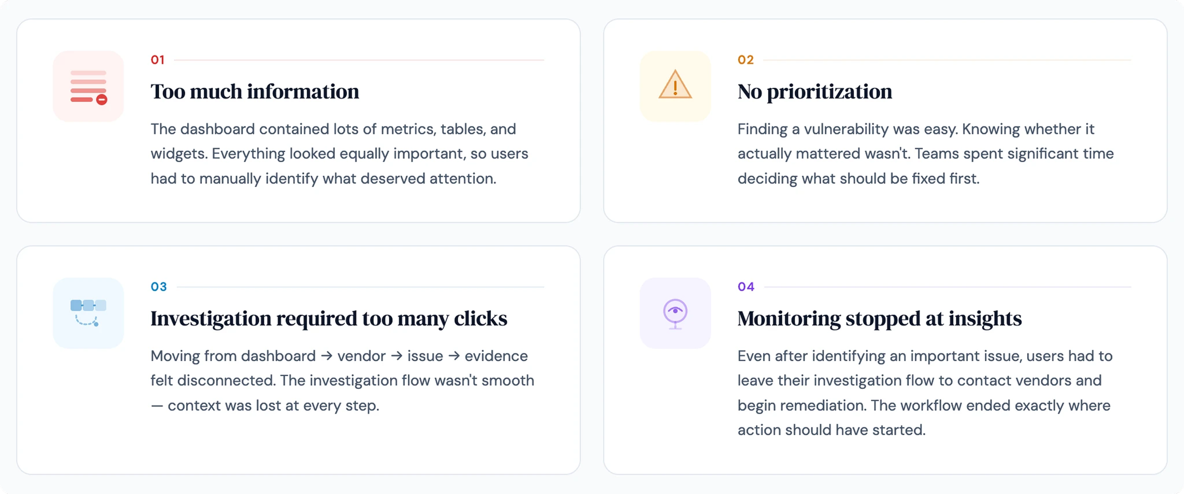
After reviewing the existing experience, four major problems became clear.
Defining the Experience
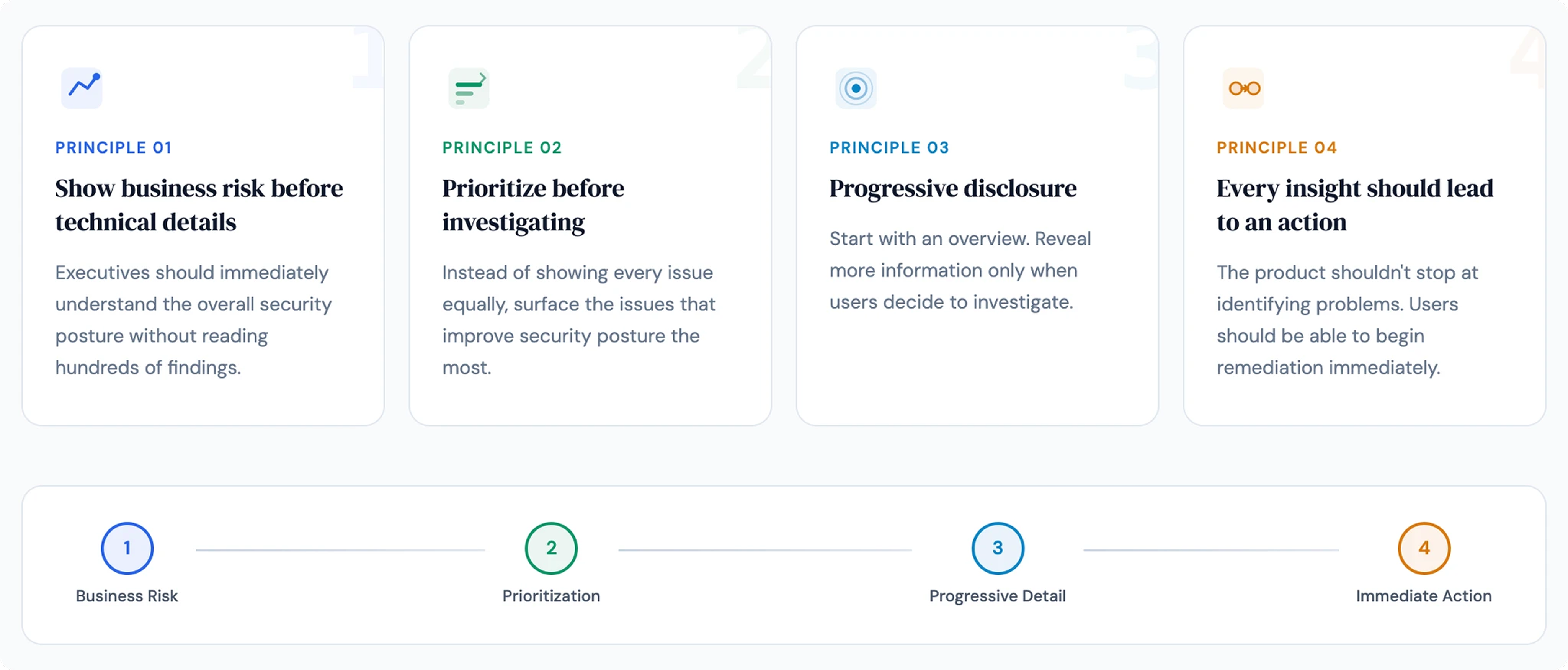
Instead of redesigning individual screens, we redesigned the product around four principles.
Redesigning the Dashboard
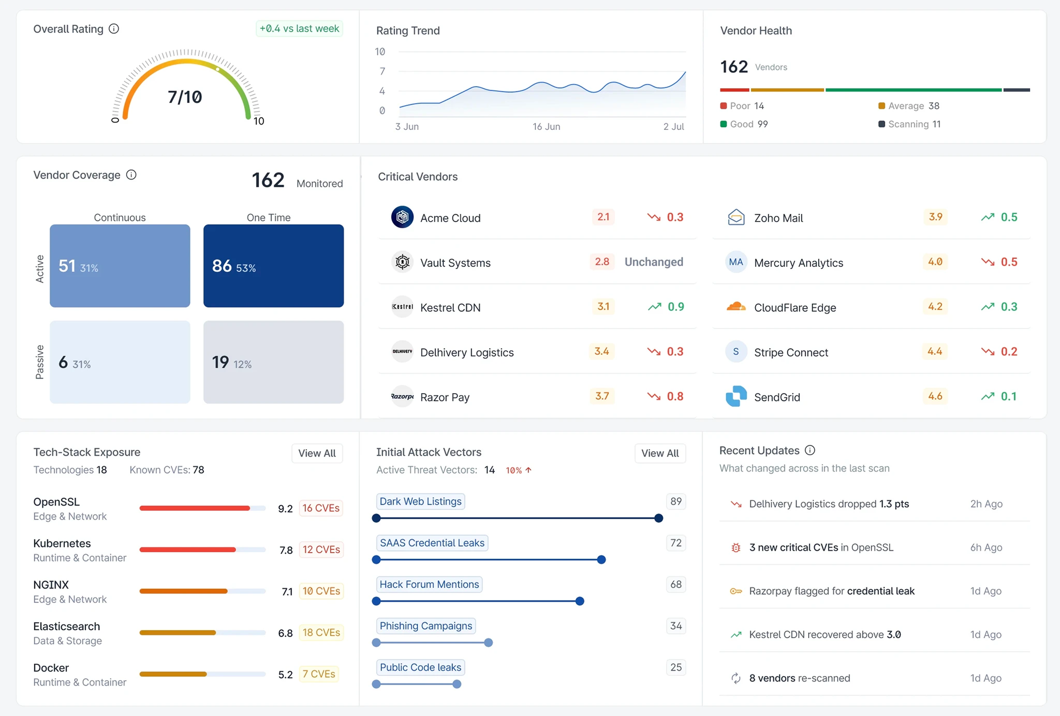
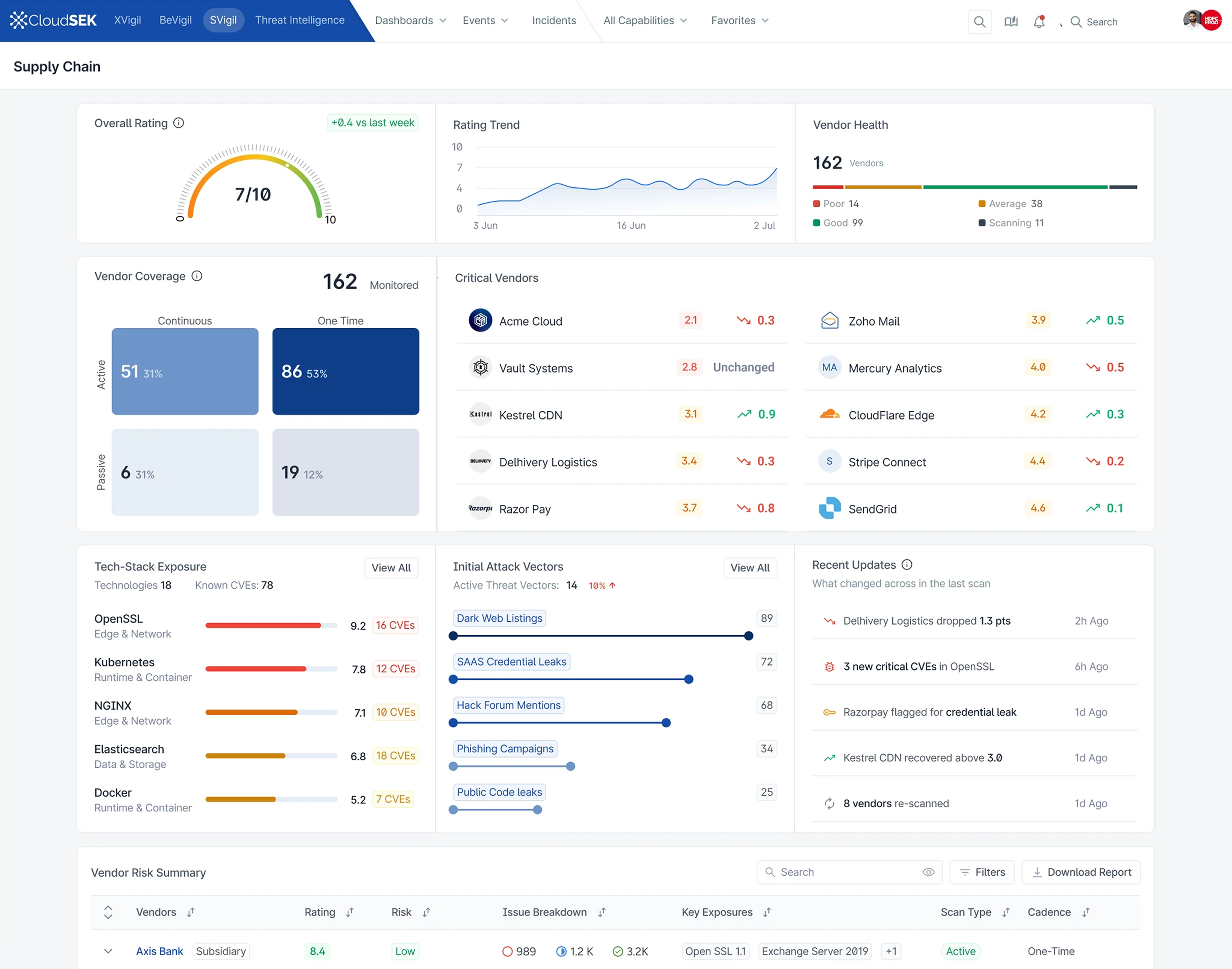
The dashboard became the entry point for decision-making.
Instead of presenting isolated widgets, every section answered a specific question.
Overall Risk Score
The first thing users now see is the overall organisational risk score.
This provides an immediate understanding of security posture without reviewing hundreds of vendors.
Risk Trend
Showing historical movement makes it easy to understand whether the organisation's security posture is improving or declining over time.
Critical Vendors
Rather than forcing users to search through long vendor lists, the dashboard immediately highlights vendors requiring attention.
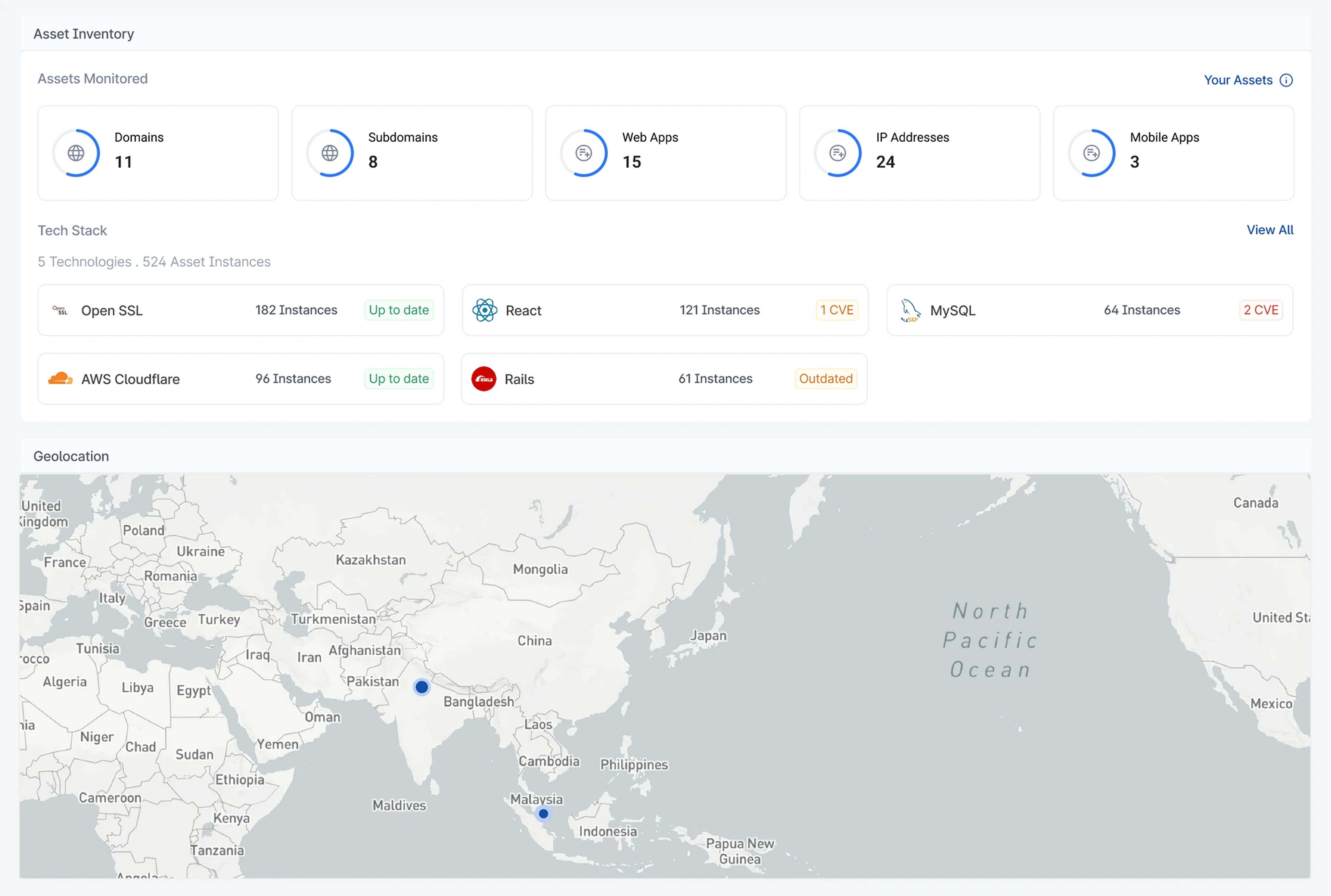
Technology Exposure
Instead of viewing vendors independently, users can understand which technologies create the highest shared risk across the ecosystem.
Recent Updates
Recent changes help users understand what's new since their last visit, reducing the need to manually search for changes.
Helping Users Prioritize
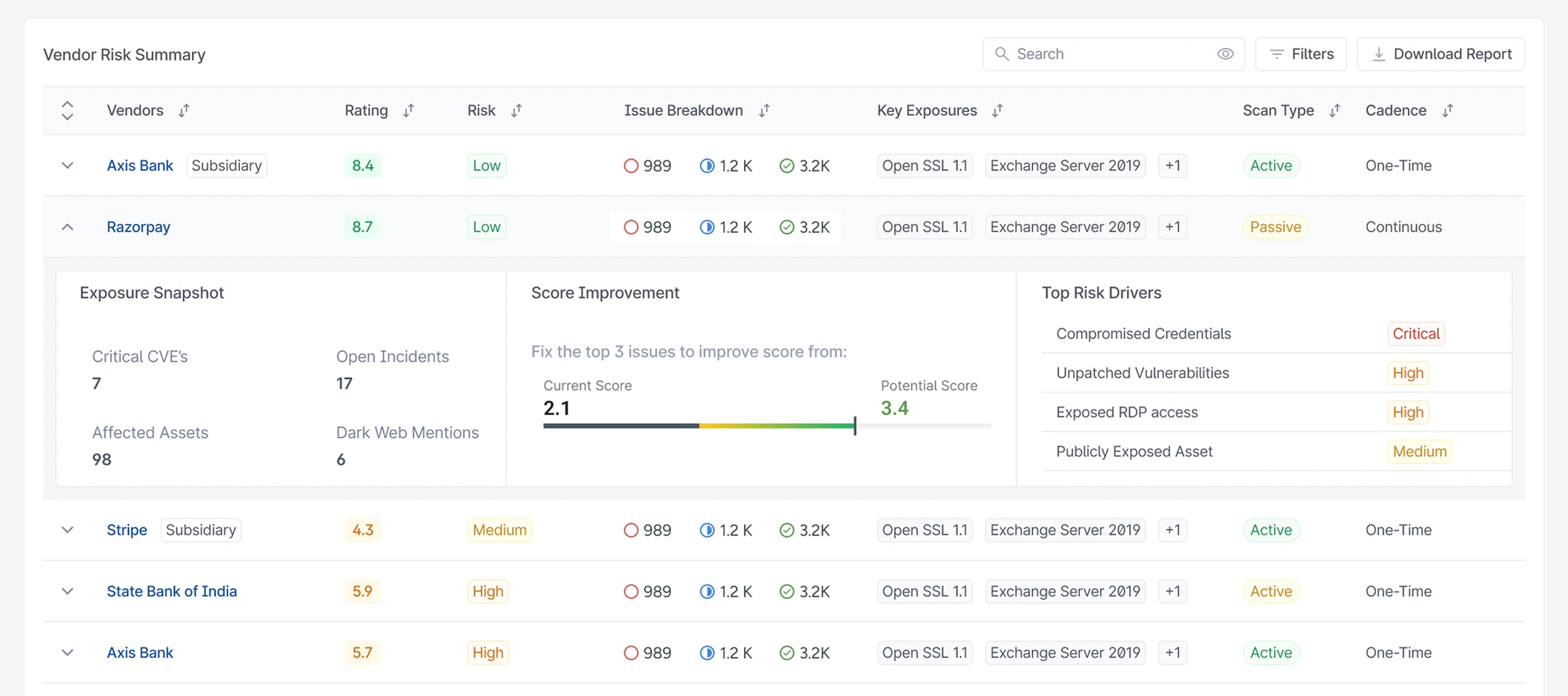
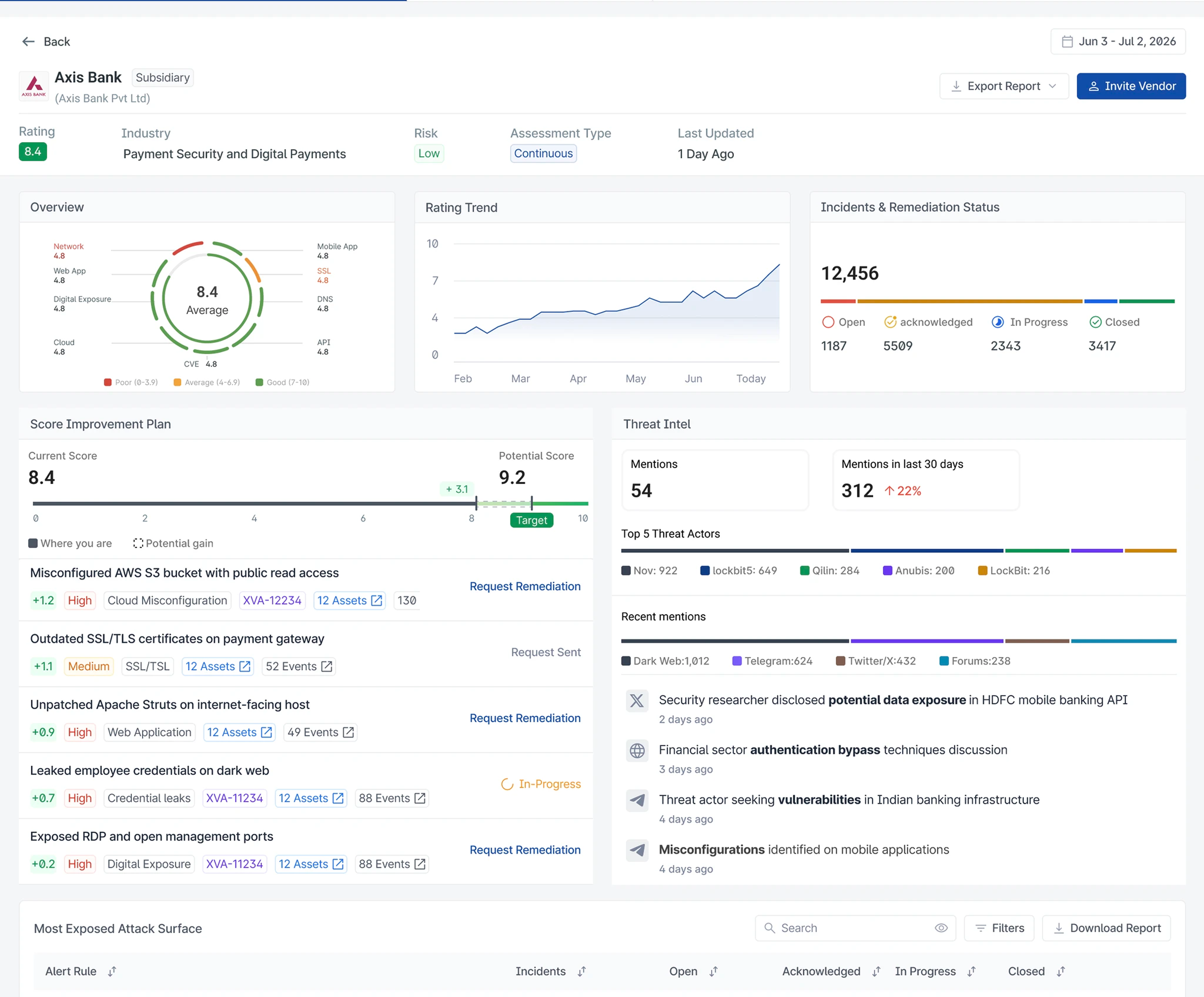
One of the biggest changes was shifting from listing findings to prioritising outcomes.
Instead of asking users to fix everything, we introduced a Score Improvement Plan.
Each issue now explains how much it can improve the vendor's security score if remediated.
"Here are 300 issues."
"Fix these five issues first."
For security teams, this dramatically reduces the time spent deciding where to begin.
Making Investigation Faster
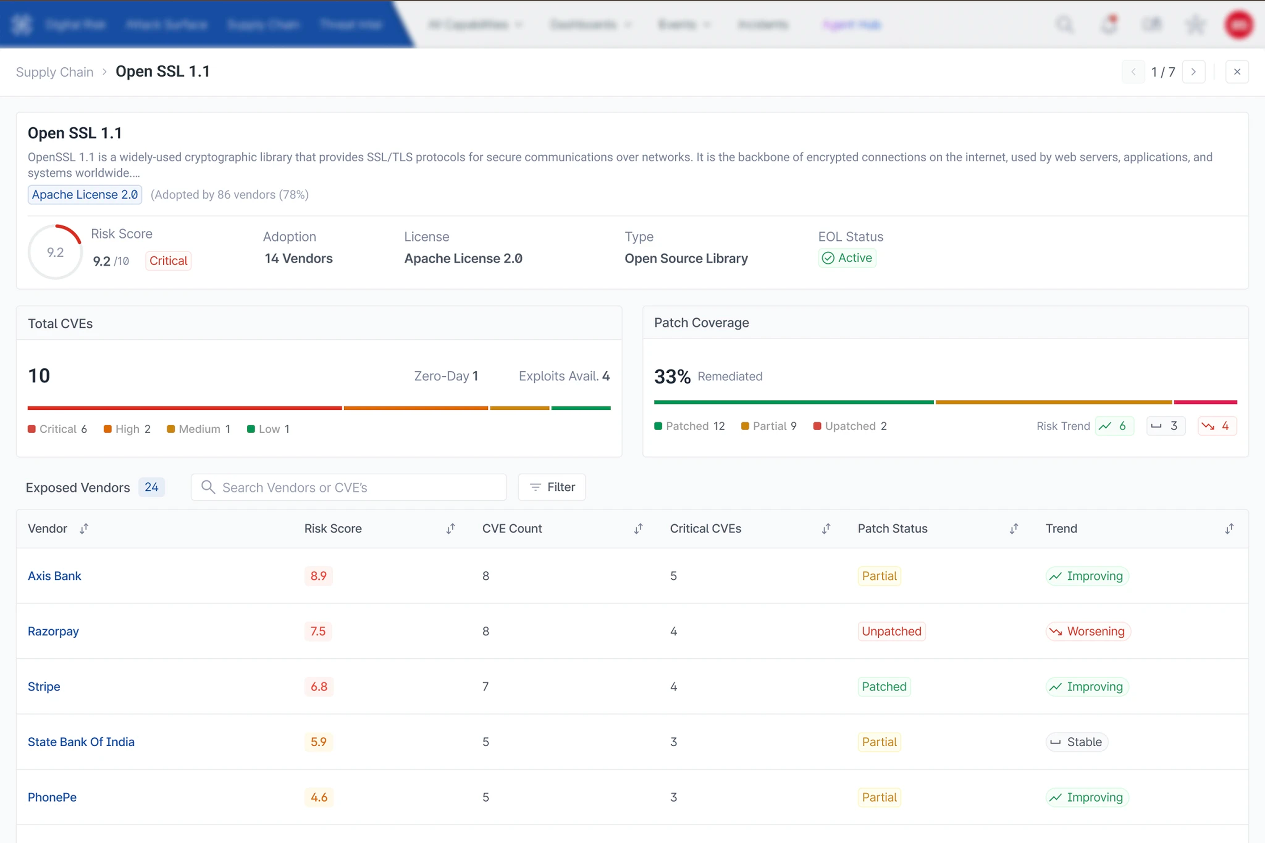
Security analysts often need to investigate before taking action.
Instead of navigating through multiple pages, we introduced focused investigation views that progressively reveal information.
Every issue presents:
- Affected assets
- Supporting evidence
- Severity
- Remediation guidance
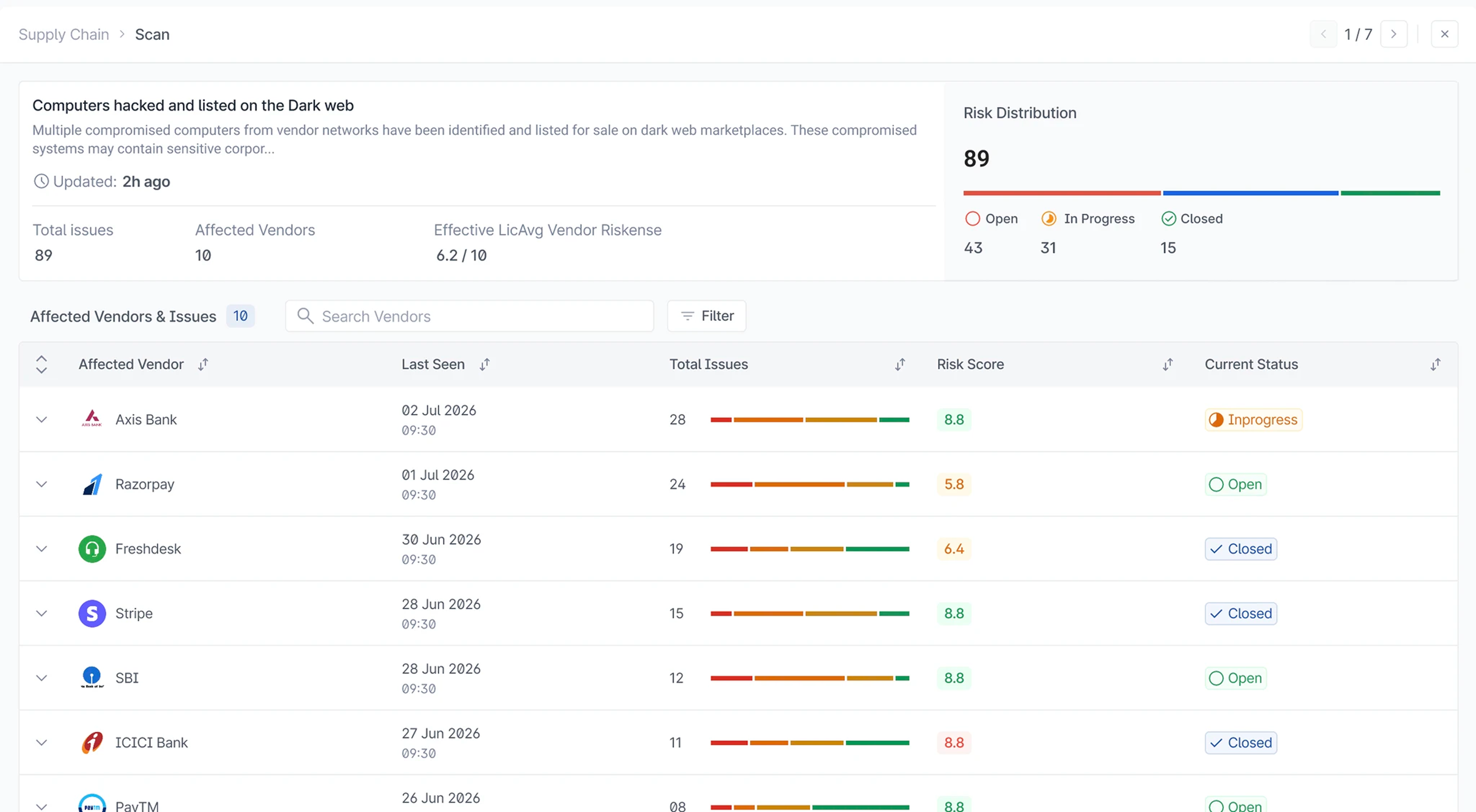
This keeps analysts inside a single workflow while reducing unnecessary context switching. The issue drawer requirements emphasise evidence-led investigation.
Connecting Insight to Action
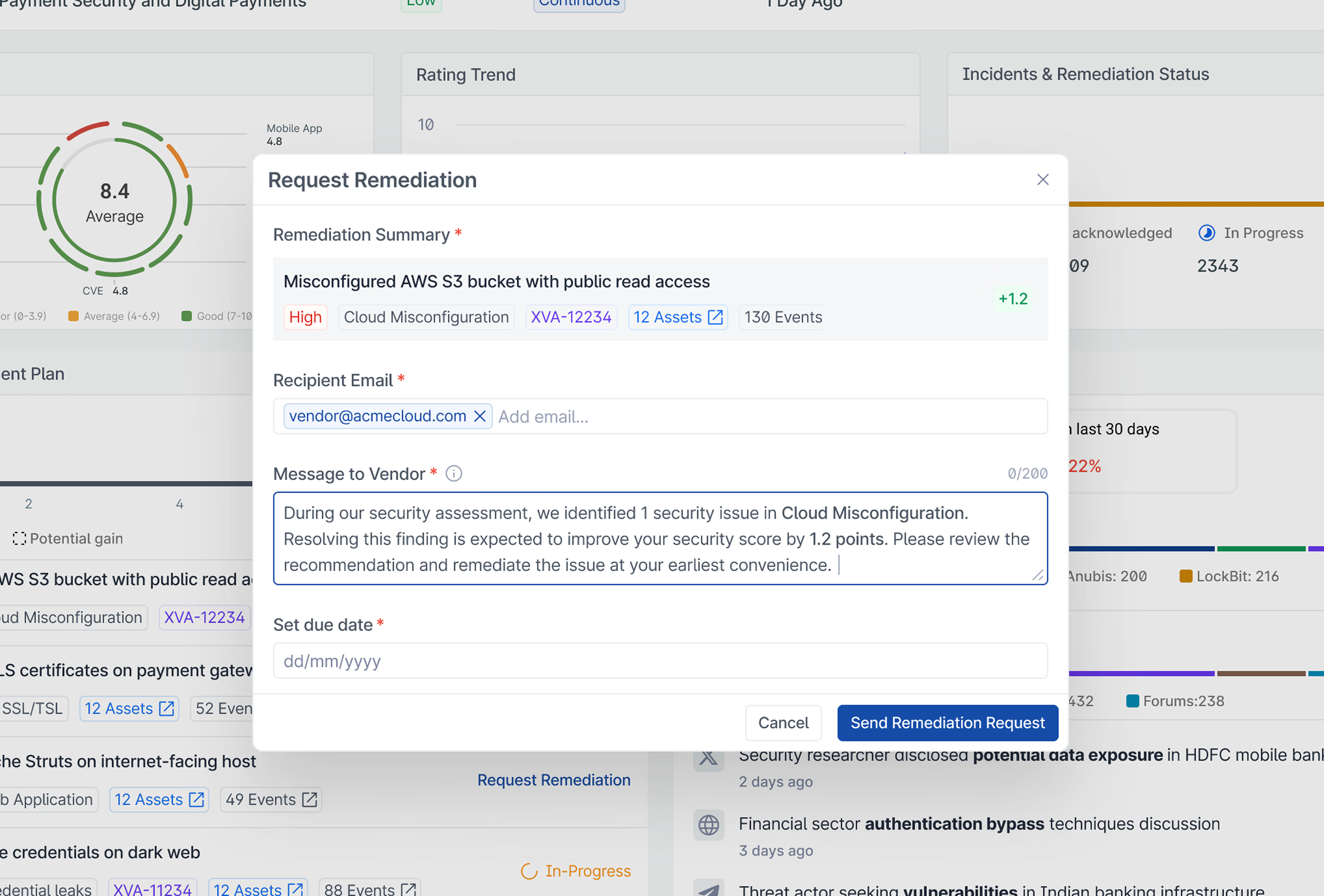
Finding problems is only half the job.
Teams still need to work with vendors to resolve them.
To close this gap, we designed an integrated remediation workflow.
Users can:
- select issues
- preview expected score improvement
- choose vendor contacts
- edit the remediation message
- send the request directly from SVigil (Supply chain security)
Instead of ending at analysis, the workflow now continues through communication and remediation.
Outcome
The redesign fundamentally changed how users interacted with SVigil (Supply chain security).
Instead of acting as a dashboard full of security metrics, the product became a decision-making tool.
The experience now helps users:
- Understand overall business risk in seconds.
- Identify which vendors need immediate attention.
- Investigate issues with less context switching.
- Prioritise remediation based on impact.
- Start remediation directly from the product.
These outcomes directly support the goals defined in the PRD: improved dashboard engagement, better prioritisation, faster investigations, and greater remediation adoption.
Why the Overall Risk Score is positioned first:
CISOs and executive security leaders need immediate strategic posture awareness without wading through hundreds of raw vendor rows. Placing the score at the top left creates an instant executive cognitive anchor.
Why the dashboard uses progressive disclosure:
Security data overwhelm causes decision fatigue. Progressive disclosure allows analysts to start with macro organizational metrics, opening focused detail drawers only when investigating a specific anomaly.
Why certain cards are grouped:
Grouping Tech-Stack Exposure alongside Initial Attack Vectors connects infrastructure vulnerabilities directly to external threat intelligence, answering why an asset vulnerability matters.
Why the vendor page is organised in a particular order:
The layout prioritises action by showing the Score Improvement Plan before raw issue lists, turning an overwhelming issue count ("300 issues") into an actionable roadmap ("fix 5 key items").
What alternatives were explored and rejected:
We explored traditional flat data tables with extensive filter bars. We rejected this because user interviews confirmed that filters alone didn't solve the core question: "Which action yields the highest risk reduction?"