
Finance Terminal mobile app
Redefining the financial research Workflow — From Desktop Terminal to Pocket-Sized Powerhouse.
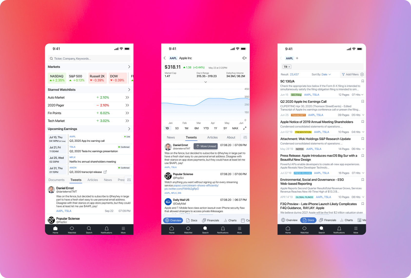
Sentieo Mobile App: High-density financial research, contextual sub-navigation, and tokenized document search
Project Overview
Overcoming Information Moats
Financial analysts and portfolio managers deal with an overwhelming "information moat." Historically, the tools required to search through SEC filings, broker research, and earnings transcripts were restricted to powerful desktop terminals. When away from their desks, analysts were forced to rely on clunky PDF viewers and fragmented note-taking apps, leading to "knowledge gaps" and delayed decision-making.
A Professional Research Ecosystem
We designed the Sentieo Mobile App to be a professional-grade research ecosystem. The goal was to translate a high-density data platform into a mobile-first experience that allows users to discover, analyze, and collaborate on financial insights anywhere.
The Intelligent Launchpad: High-Utility Information Architecture
The Home screen was designed as a "command center" to solve the primary analyst pain point: The need for constant, real-time awareness in a fast-moving market. By implementing a modular Widget-Based UI, we prioritized immediate scannability of high-value data points.
The Markets widget provides an instantaneous global pulse, while the Upcoming Earnings section acts as a critical time-management tool, alerting users to live calls and confirmed releases.
This layout eliminates the need for deep navigation, consolidating disparate data streams—from Starred Watchlists to real-time Social Sentiment (Tweets)—into a single, unified feed for immediate at-a-glance accessibility.
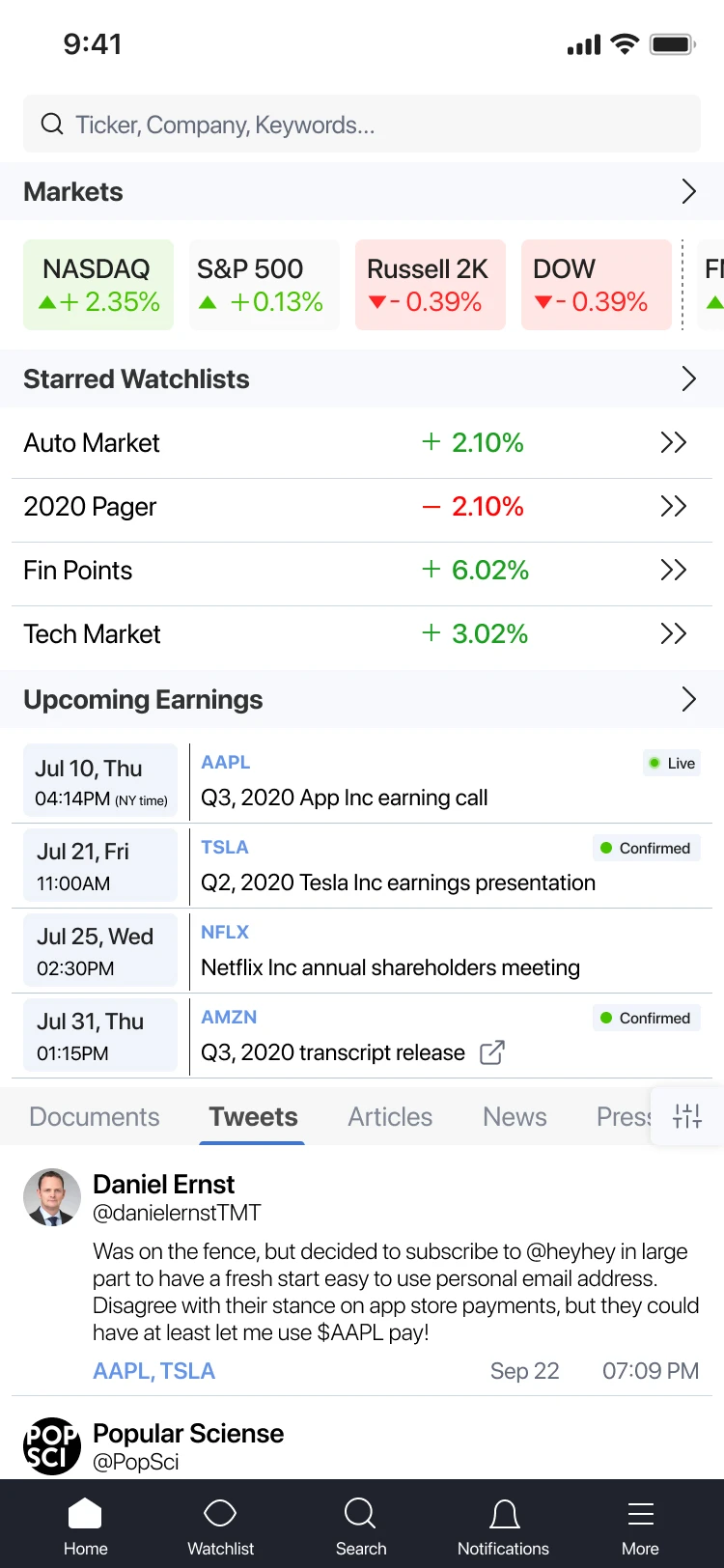
Intelligent Launchpad: Modular command center with Markets widget, Watchlists, Earnings calendar, and real-time Tweet sentiment
Revolutionizing Research with Fluid Navigation
The "One-Tap" Analyst — Streamlining Deep Financial Research via Persistent Sub-Navigation
The Game Changer: The Contextual Sub-Bottom Bar
The core innovation of this interface is the introduction of a persistent Sub-Bottom Navigation Bar that appears once a specific ticker (e.g., $AAPL) is selected. This feature transformed the app from a simple news reader into a portable terminal.
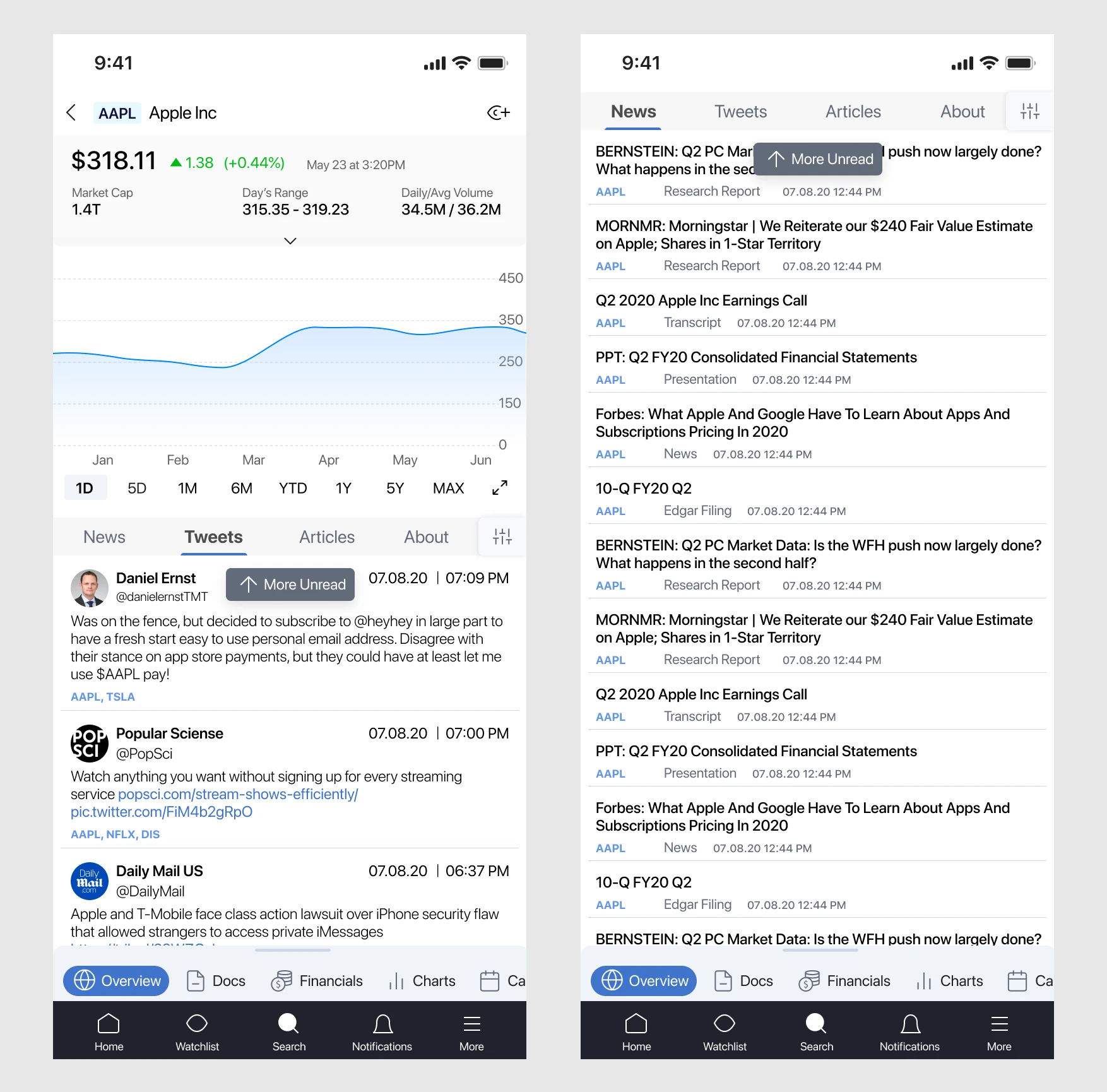
Persistent Sub-Bottom Navigation: Anchors $AAPL ticker context across Overview, Docs, Financials, and Charts
Design Logic & UX Breakdown
Instead of a deep hierarchy, we implemented a horizontal sub-navigation layer that sits just above the primary app menu. This allows analysts to toggle between Overview, Docs, Financials, and Charts with a single thumb-tap.
Once an analyst enters a company’s "universe," the ticker remains anchored. The sub-bar ensures that no matter which data set they are looking at—be it a complex chart or a dense 10-K filing—they can pivot to another metric without losing their current research session.
By reducing click-depth, we significantly lowered cognitive load. An analyst can verify a price movement in the Overview, jump to Docs to read a press release, and switch to Financials to see balance sheet impact—all within seconds.
The sub-bar is styled with clear, recognizable icons (Globe for Overview, Spreadsheet for Financials) to facilitate muscle memory, making transitions between different data types feel intuitive rather than technical.
This architectural shift moved the user experience from "navigating an app" to "interacting with a dataset." It successfully brought the efficiency of a multi-monitor desktop terminal to the constraints of a 6-inch mobile screen.
Intelligent Search & Discovery
Financial analysts were stuck at their desks because mobile research tools were too clunky. They had to jump between many different apps to see stock prices, read PDFs, and check social media, which made them lose focus and miss important market shifts. My goal was to build a "pocket terminal" that felt as powerful as a desktop but was easy to use on the go.
The "One-Tap" Navigation
- •I designed a persistent Sub-Bottom Bar that appears once you select a stock.
- •I wanted to end the constant "back-and-forth" navigation.
- •Now, once I select a ticker like Apple ($AAPL), I can switch between Overview, Documents, and Financials with one tap without ever leaving that company's view.
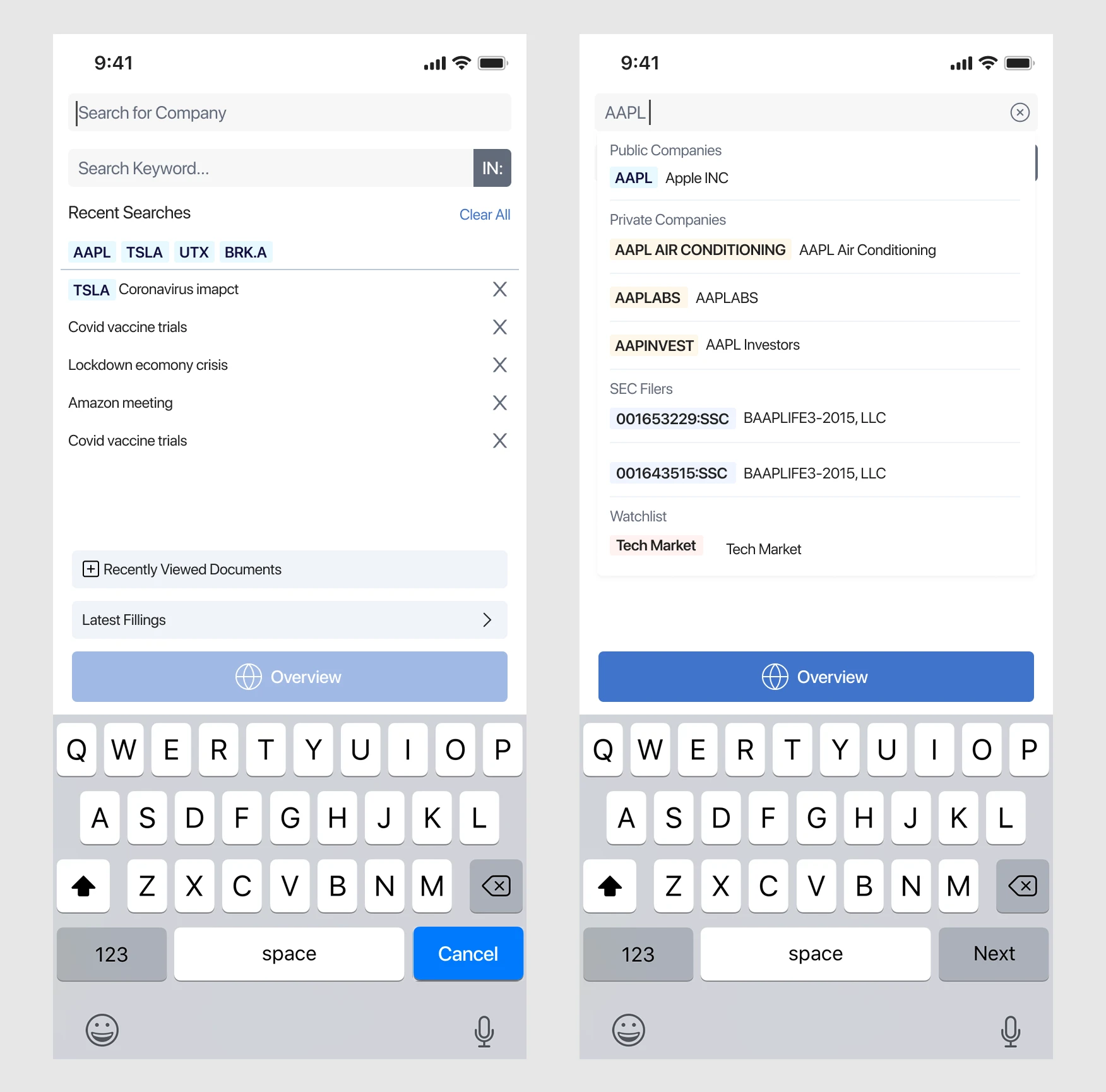
Dual-Search System: Company stock lookup vs Keyword document search interfaces
Intelligent Search & Tokenization
I built a dual-search system to make finding data faster.
I separated the Stock Search from the Keyword Search so the app knows exactly what I'm looking for.
When I select a stock, I "tokenized" it into a blue pill in the search bar. This locks the focus so I can search for keywords like "Inflation" or "Coronavirus" specifically within that company's SEC filings.
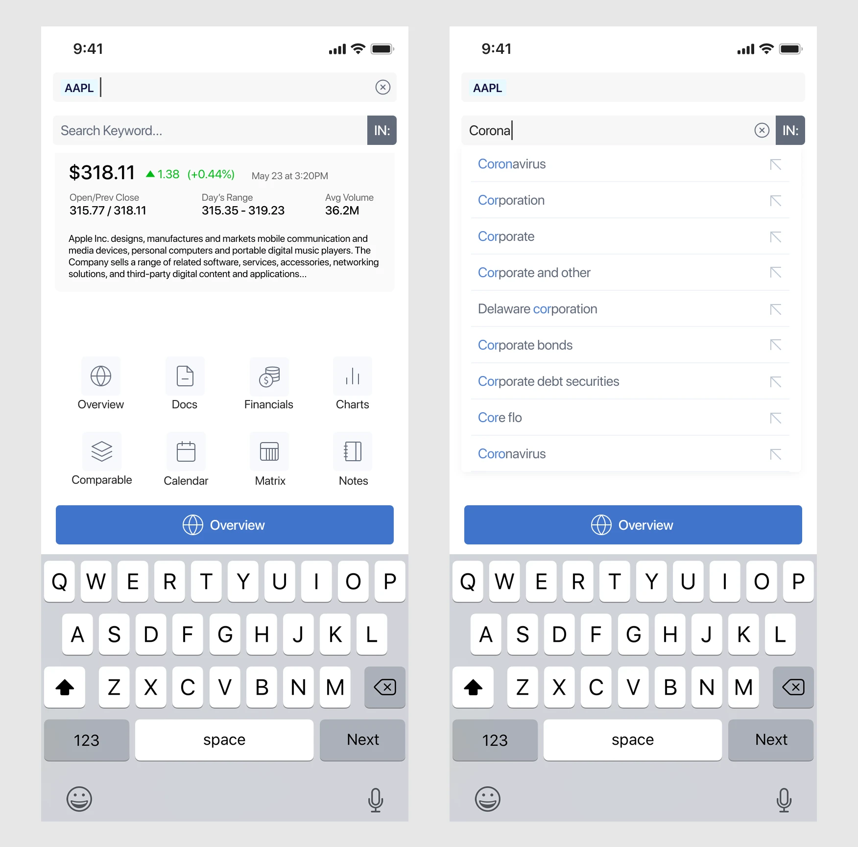
Tokenized Search: Blue pill ticker focus ($AAPL) enables precise keyword filtering inside SEC filings and transcripts
The "Smart" Results Page (SERP)
I successfully turned a complex desktop research experience into a powerful, mobile-first workstation. By focusing on smart navigation and data-heavy search results, I made it possible for analysts to find critical insights in seconds, even while away from their desks.
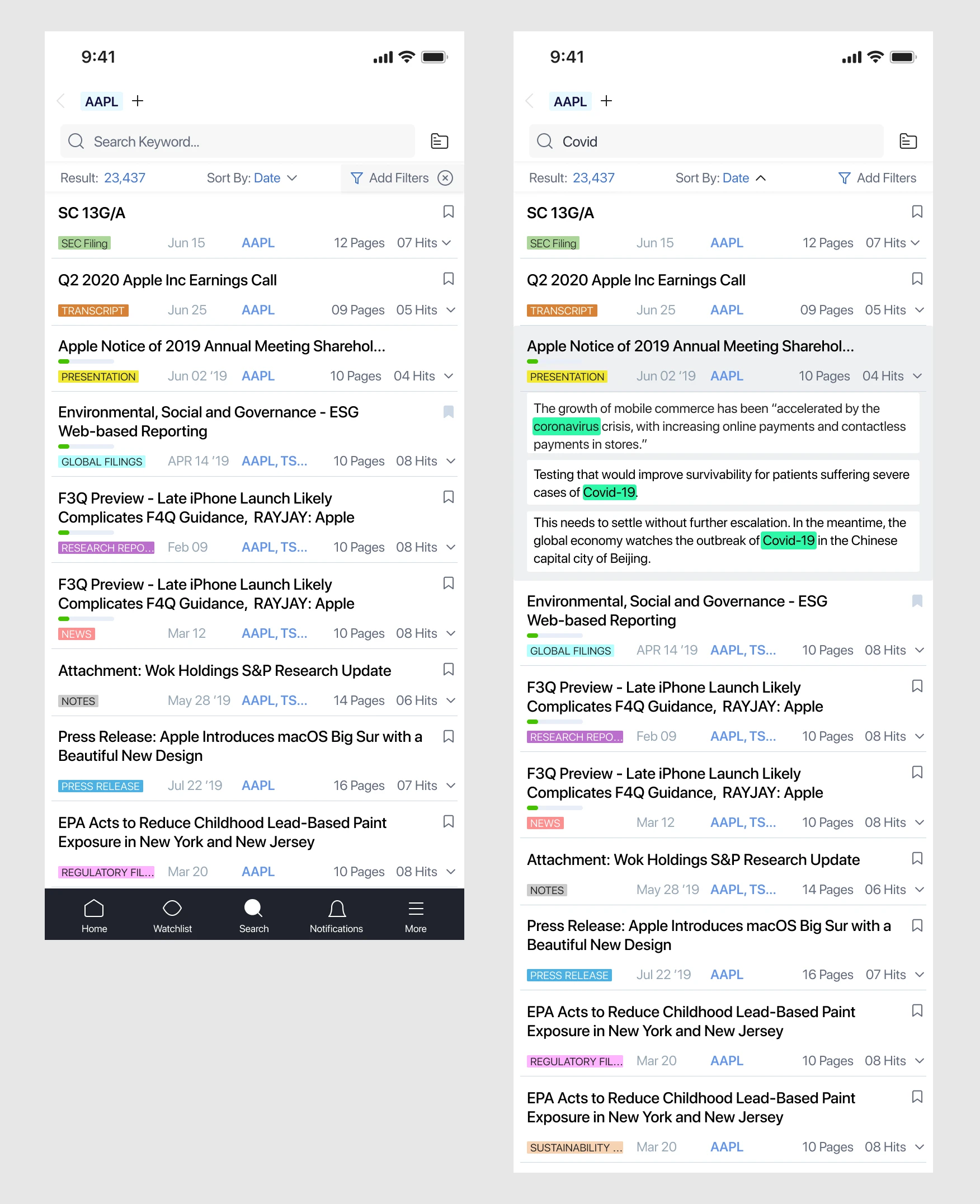
The Smart Results Page (SERP): High-density document listings with color-coded filing tags and keyword highlight snippets
My Key Reflections
Focus on Efficiency
I learned that for financial professionals, saving time is the ultimate "feature." Every second saved in searching is more time they can spend on high-level analysis.
Designing for High Density
Working on this app taught me how to balance massive amounts of data with a clean UI. I found that using visual cues like color-coded badges and snippets helps users process information much faster than plain text.
Real-World Impact
My favorite part of this design was the sub-bottom navigation. It was a simple change, but it completely changed how analysts moved through their workflow, making the app feel more fluid and intuitive.
Final Takeaway
This project reinforced my belief that mobile design shouldn't just be a "lite" version of a desktop app. By understanding the specific needs of my users, I was able to create a tool that actually improves their professional productivity.
Desktop Power in a 6-Inch Screen: The Sentieo Mobile App eliminated knowledge gaps for hedge funds and equity analysts on the move. By reducing click depth and introducing tokenized document search, analysts achieved terminal-grade research velocity from anywhere.